


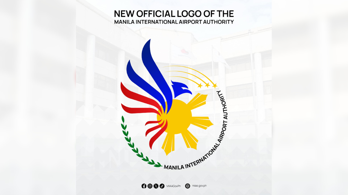

The Manila International Airport Authority (MIAA) unveiled its new logo for its 43rd anniversary on Friday, but instead of praise, it was met with widespread criticism from netizens.

Social media users flooded MIAA’s Facebook post with negative comments, calling the design “ugly” and comparing it to a school project. Many expressed disappointment, saying the previous logo was better. The backlash was so intense that the post received over 4,400 laughing reactions—far outweighing its 632 likes—before the comments section was disabled.
MIAA defended the redesign, stating that the new logo represents a “refreshed brand identity” aligned with its revised mission and vision. The agency explained that the Philippine Eagle symbolizes leadership and commitment to airport efficiency, while its red and blue wings represent connectivity. Additional elements, including a green laurel, three stars, and four sun rays, were also meant to highlight different aspects of the authority’s role.
However, online users quickly pointed out a striking resemblance between the eagle in MIAA’s logo and a $15 stock image available on the Vector Stock website.
Freelance multimedia artist Christian San Jose, who won MIAA’s logo-making contest in 2023, also weighed in on the controversy. While he had no issue with the agency opting for a different design, he admitted he was curious about the selection process. His winning design, which featured four planes forming the letters “MIAA” in negative space, was not used.
