


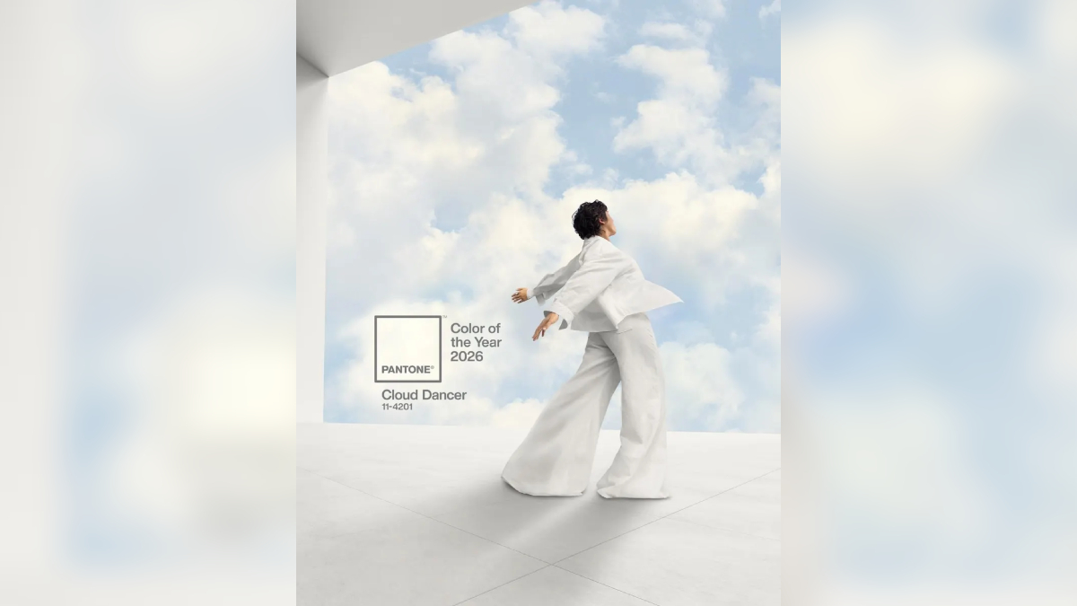

Pantone has introduced Cloud Dancer as its chosen color for 2026, giving artists, designers, and trend forecasters a clear reference point for the creative year ahead. The announcement appeared across the company’s platforms, where it emphasized the shade’s tranquil character, calling it a color that “symbolizes a calming influence in a society rediscovering the value of quiet reflection.”
The company further described Cloud Dancer as one that “invites true relaxation and focus, allowing the mind to wander and creativity to breathe.” Its soft, airy white finish is also highlighted on the Pantone website, where Pantone Color Institute vice president Laurie Pressman said the hue reflects a collective desire to reset. Pressman noted that Cloud Dancer’s weightless quality “opens up space for creativity” and gives room for new ideas to form.
The announcement continues a long-running annual tradition that has influenced global creative industries. Each year’s chosen color becomes a touchpoint for visual direction, with many creators shaping upcoming projects around the selection. In 2021, for example, a fan pointed out that certain BTS album designs echoed the Color of the Year.
Pantone’s choices in recent years have mirrored shifting cultural moods. Mocha Mousse—named the 2025 Color of the Year—was positioned as an expression of the world’s appetite for comfort and simplicity. The previous year’s Peach Fuzz carried an emotional theme as well, described by Pantone Color Institute executive director Leatrice Eiseman as conveying an “innate yearning for closeness and connection.” Eiseman also noted that the shade “resonates with compassion, offers a tactile embrace, and effortlessly bridges the youthful with the timeless.”
Viva Magenta led 2023 with a bold message, promoted as a “powerful and empowering” tone meant to encourage creative freedom. The year before that, Very Peri introduced a departure from past selections as the first custom-created Color of the Year, defined as “a dynamic periwinkle blue hue with a vivifying violet red undertone.”
Pantone’s history of annual colors includes significant thematic choices, such as the Rose Quartz and Serenity pairing in 2016, which reflected ongoing conversations about gender, and 2018’s Ultra Violet, a color designed to evoke exploration of “new technologies and the greater galaxy.”
